Megaworld Studios
ROLE: UX Designer (Contract)
CLIENT: Megaworld Studios
PROJECT: Cats In Mechs
WHEN: 2016
The What
Megaworld Studios contacted me to help them solve a variety of user experience problems they were experiencing with their still in development F2P mobile game, Cats In Mechs. They wanted help revamping player combat interactions, the structure and flow of existing and new menu systems, and help figuring out the experience of various monetization elements before they were comfortable showcasing the game to potential publishers.
My process for this project was going to be modified a bit due to a few factors. The client already had the game in a very playable state with most of the elements that needed attention already implemented and playable for me to evaluate. The Lead had already been collecting feedback from users who had been testing the game, hence the data used to backup the need for the fixes. I would need to research mobile games since my experiences thus far had only been in console games.
Far too many artifacts have been generated to show in this portfolio piece so I’m going to select a few screenshots to highlight each section and then show a process example towards the end. I have also included some screenshots showing some of the in-game solutions created by the team's graphic artists I've been working with.
Envision
My first step was to converse with the Studio Head and ask a ton of questions and take a ton of notes. I needed to understand the problems they were having, why they thought they were problems, discuss the user feedback they had collected, and what the Studio Head’s desired solutions were to be. We had many long and productive phone calls to get things started.
We bucketed the deliverables into three milestones that matched up with the team’s development schedule. By the time I had a wireframe finished the team was ready to implement it.
Research
I was not super familiar with the intricacies of mobile gaming before this project, so I needed to do a deep dive and familiarize myself. I accomplished this by playing a healthy amount of mobile games and taking a lot of notes. Many of the games I played were inspirational for Cats In Mechs and other games were in different genres. I wanted to ensure I was gathering a healthy amount of information from as many different sources as possible. I wanted to experience different interaction models, monetization models and social interactions between players. Deep diving into and researching unfamiliar topics to better understand them is a part of being a UX Designer that I absolutely love.
Ideation
Each Milestone had its own ideation phase that allowed myself, the Project Lead and the team to focus on the relevant deliverables. I would ask a ton of questions to understand the problems and the desired outcomes and then generate designs based on these elements. I would discuss the different solutions with the Project Lead and the team, get their feedback, iterate and then narrow down the ideas to the favorites so I could move forward into creating wireframes.
Wireframes
Once the Studio Head and I had a solution that was close to meeting specifications we moved on to wireframing to see how a solution would look further realized. For screens that already existed in game I took screenshots and created my own art assets to quickly mockup medium fidelity wireframes. For screens and elements that didn’t exist, yet I started with Low-Fi wireframes which allowed for much faster turn around and feedback loop.
Process Example: Level Complete Screen
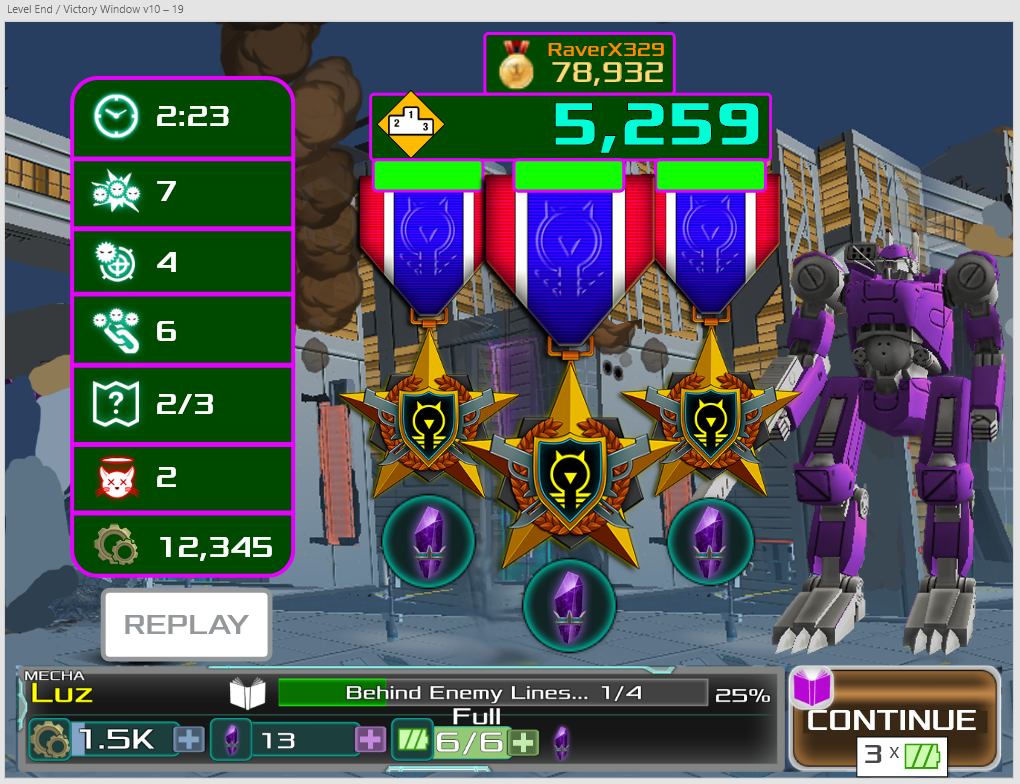
Below are some images that show some of the process I went through when designing the new Level Complete screen. The process starts on the left with the first image being a screenshot of the original screen, followed by some concept drawings, and a high-fi wireframe. The last image shows the artists implementation of my solution.
Implemented Solutions
The below screenshots showcase some of my implemented solutions. These solutions will most likely go through further iterations as we start to get feedback and insights from players. The goal is to start simple and add complexity as it’s needed.
Other Work
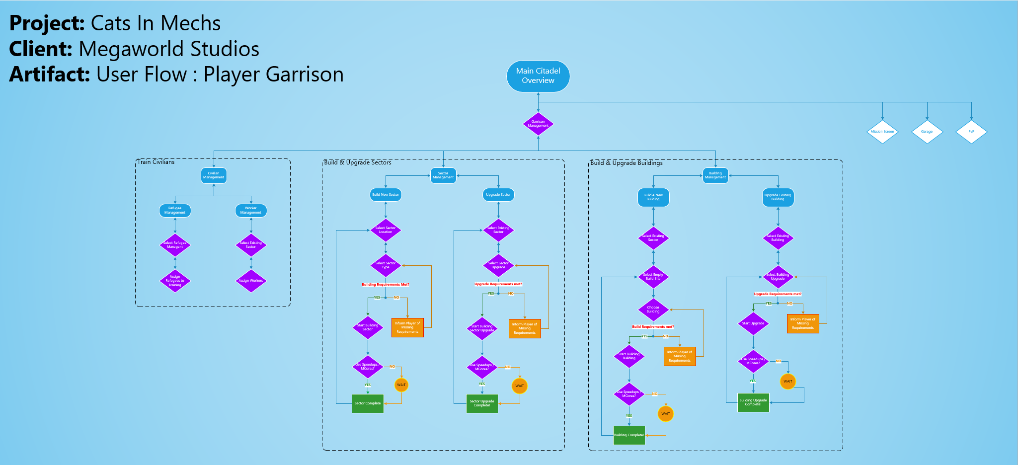
Design of additional critical features such as the player garrison. The garrison is where the player will spend a healthy amount of time and thus their experience needs to be worthwhile. I worked with my Europe based engineer counterpart in setting out to design a fun experience that encourage players to return and play the game throughout the day, weeks and months. Below are some early artifacts documenting the interaction models for building certain elements of the player garrison.


