
01
Overview
UX help for a game mid-development
This one worked differently from a normal engagement. The client already had the game in a very playable state, with most of the elements needing attention already built and running, so I could evaluate them directly. The Lead had been collecting feedback from testers, which gave us data behind every fix. And I'd only ever worked on console games, so mobile was new ground I'd need to cover.
02
Challenge
The problems to solve
Megaworld Studios contacted me to help them solve a variety of user experience problems they were experiencing with their still in development F2P mobile game, Cats In Mechs. They wanted help revamping player combat interactions, the structure and flow of existing and new menu systems, and help figuring out the experience of various monetization elements before they were comfortable showcasing the game to potential publishers.
03
Process
Questions first, then milestones
My first step was to converse with the Studio Head and ask a ton of questions and take a ton of notes. I needed to understand the problems they were having, why they thought they were problems, discuss the user feedback they had collected, and what the Studio Head's desired solutions were to be. We had many long and productive phone calls to get things started.
We bucketed the deliverables into three milestones that matched up with the team's development schedule. By the time I had a wireframe finished the team was ready to implement it.
Research
I was not super familiar with the intricacies of mobile gaming before this project, so I needed to do a deep dive and familiarize myself. I accomplished this by playing a healthy amount of mobile games and taking a lot of notes. Many of the games I played were inspirational for Cats In Mechs and other games were in different genres. I wanted to ensure I was gathering a healthy amount of information from as many different sources as possible. I wanted to experience different interaction models, monetization models and social interactions between players. Deep diving into and researching unfamiliar topics to better understand them is a part of being a UX Designer that I absolutely love.
Ideation
Each Milestone had its own ideation phase that allowed myself, the Project Lead and the team to focus on the relevant deliverables. I would ask a ton of questions to understand the problems and the desired outcomes and then generate designs based on these elements. I would discuss the different solutions with the Project Lead and the team, get their feedback, iterate and then narrow down the ideas to the favorites so I could move forward into creating wireframes.
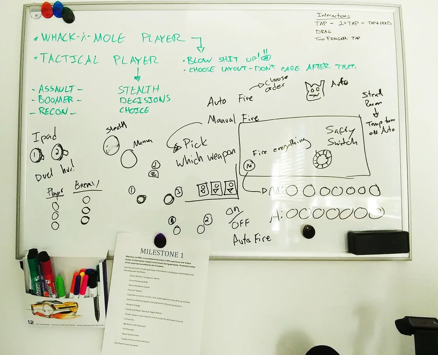
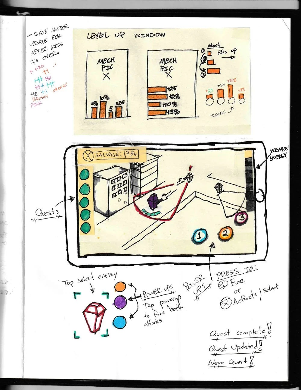
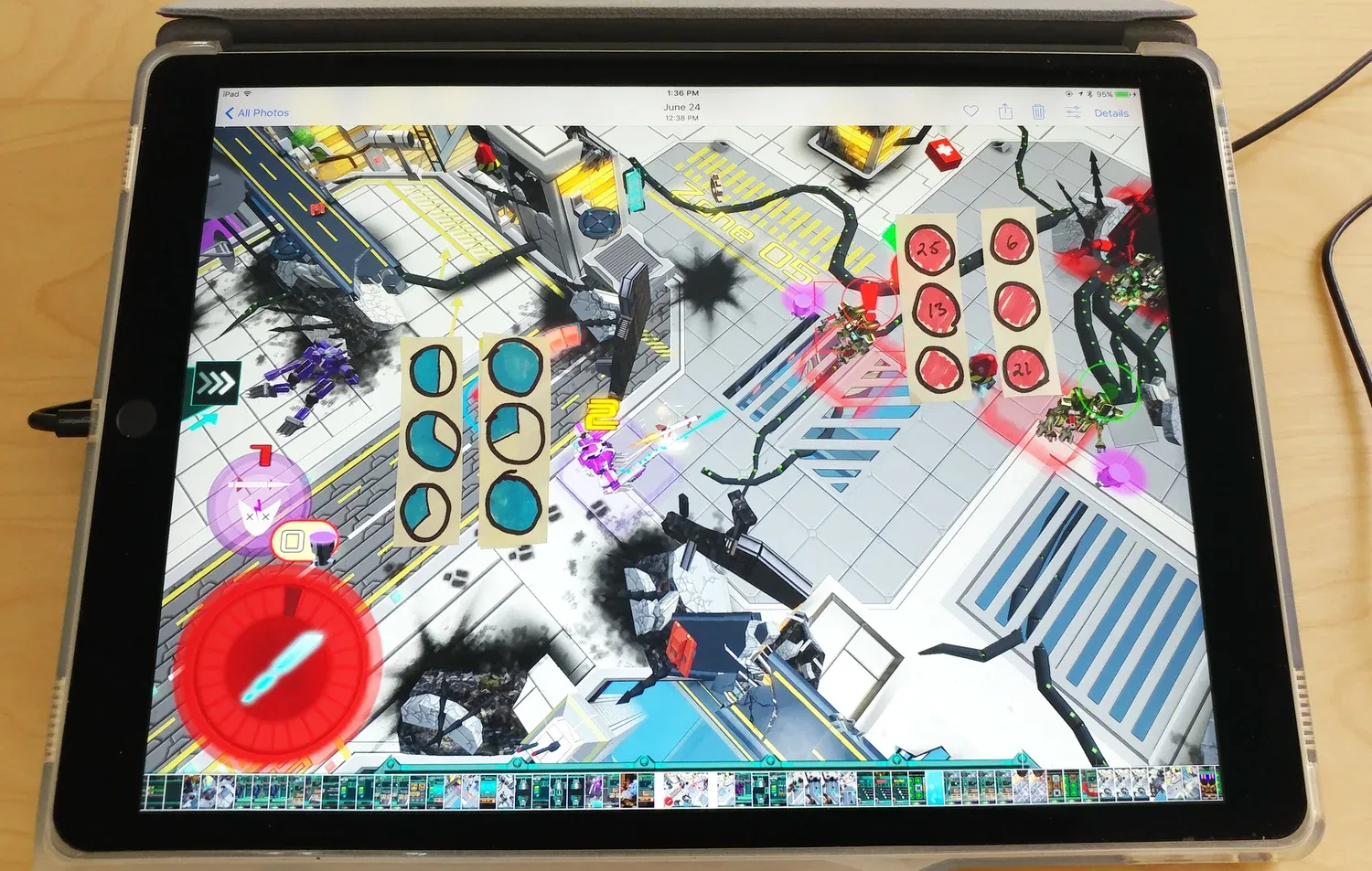
Wireframes
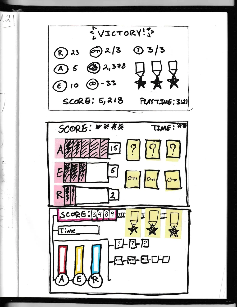
Once the Studio Head and I had a solution that was close to meeting specifications we moved on to wireframing to see how a solution would look further realized. For screens that already existed in game I took screenshots and created my own art assets to quickly mock up medium-fidelity wireframes. For screens and elements that didn't exist yet I started with Low-Fi wireframes which allowed for much faster turn around and feedback loop.
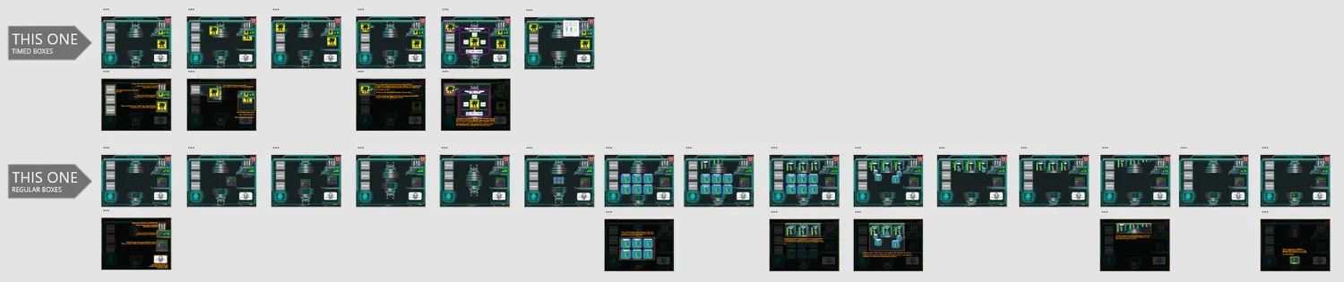
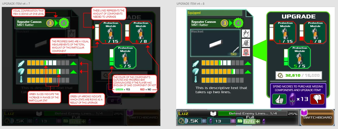
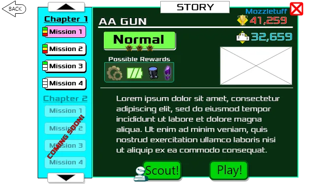
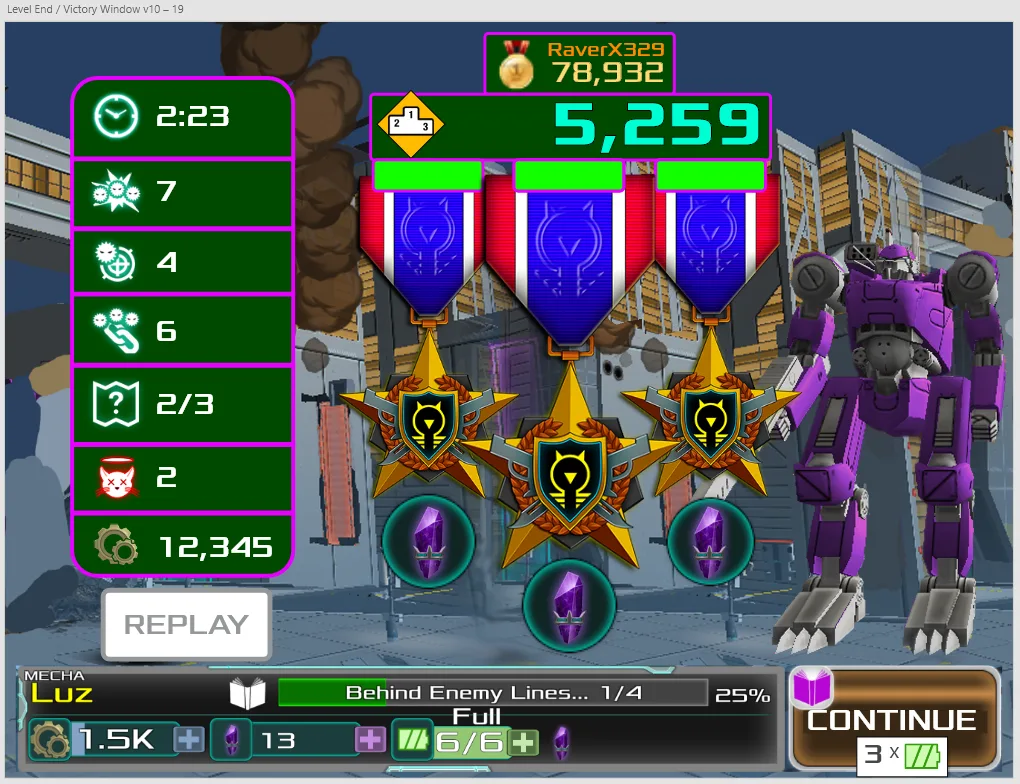
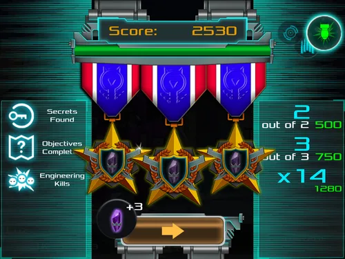
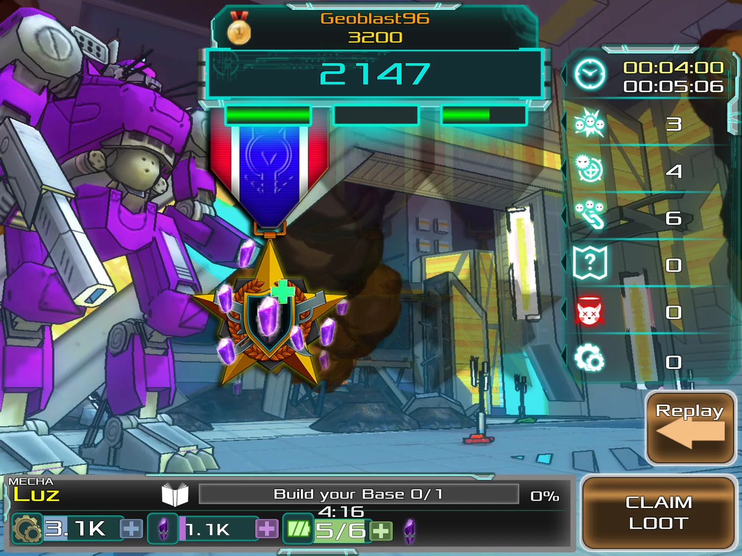
Process example: Level complete screen
The new Level Complete screen, from the original through concepts and a hi-fi wireframe to the artist's implementation.
Implemented solutions
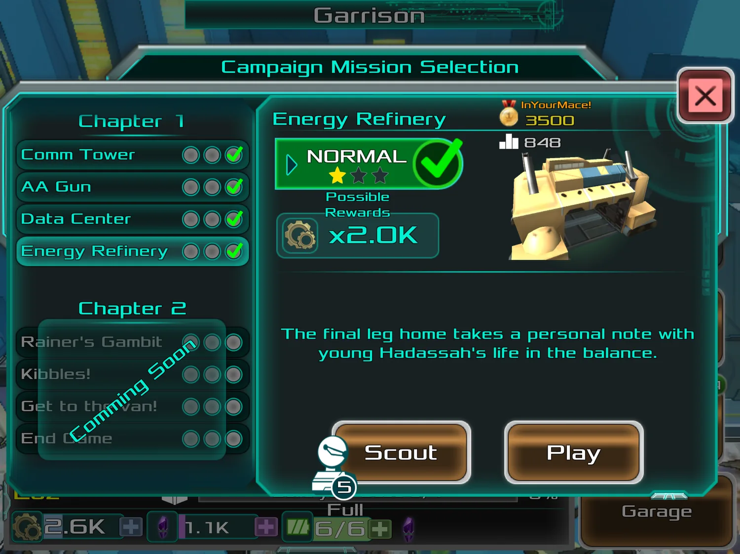
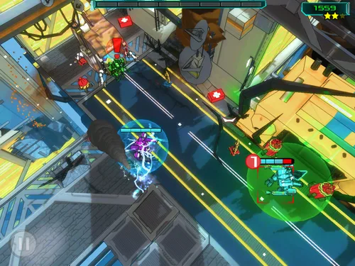
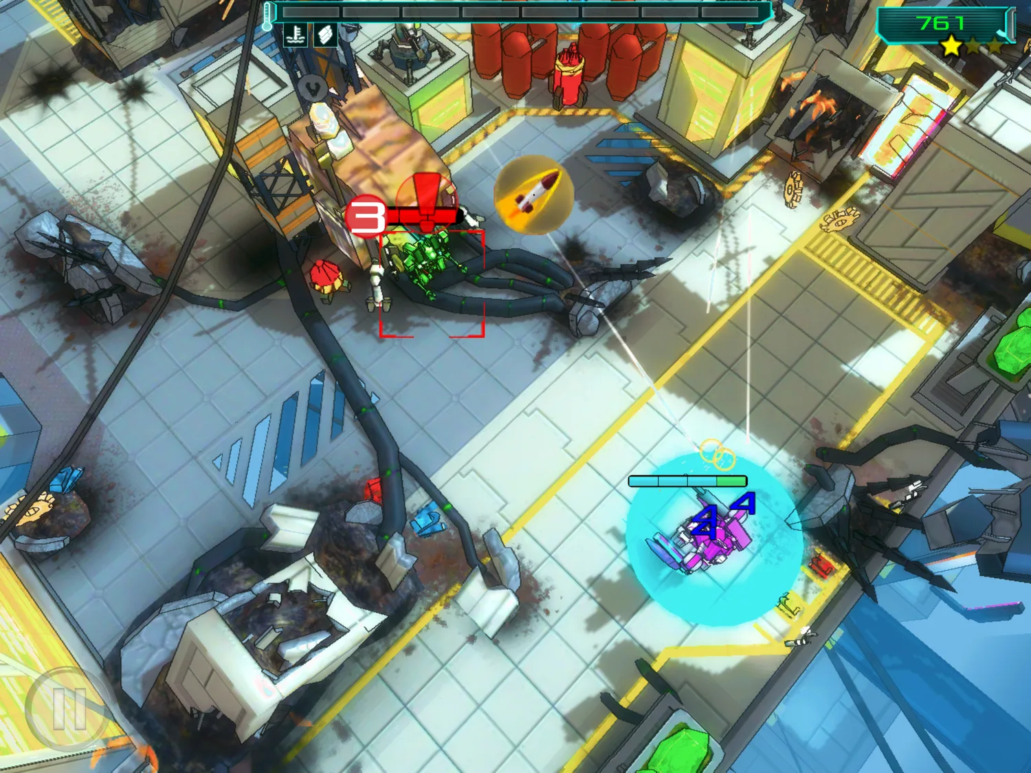
These shipped into the build. The goal was to start simple and add complexity as it proved necessary, so all of them were expected to move again once player feedback came in.
Other work
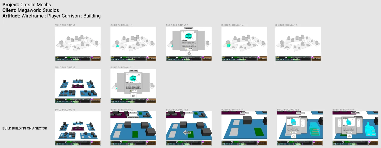
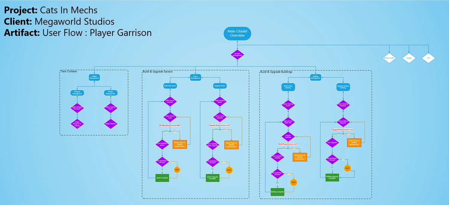
I also designed other critical features, the largest being the player garrison. Players spend a lot of time there, so the experience had to be worth returning to. I worked with my Europe-based engineer counterpart on a design meant to bring players back through the day, the week, and the months after.
04
Outcome
Into the build
By the end of my time on the project several of the redesigned screens had been implemented into the live build of the game, with additional screens planned to be added as the team prepared the game for a publisher showcase.