
01
Overview
The ticket that wouldn't scan
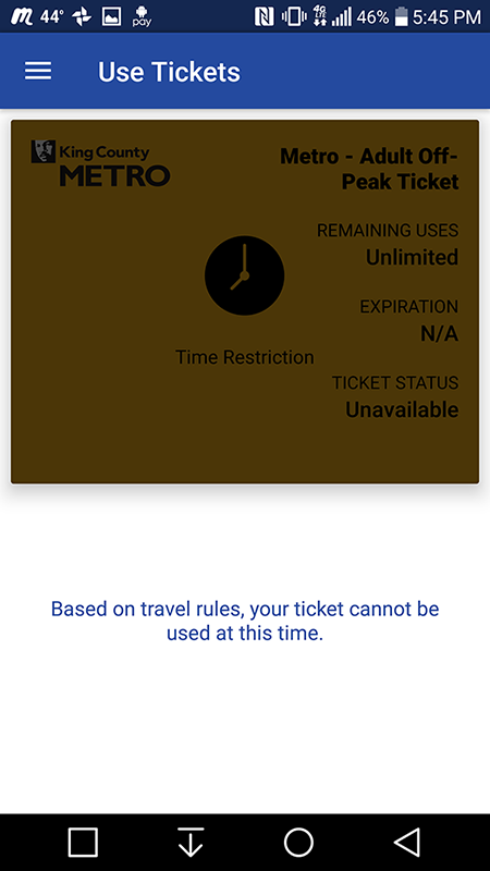
Transit GO Ticket is the app Seattle-area riders use to buy and show bus tickets. The first time I rode at peak hours, my ticket wouldn't scan. I'd bought an off-peak ticket without realizing it: Google Maps always quoted $2.50 regardless of the time or how many zones I was traveling, and nothing in the app told me otherwise.
I showed the driver the error, and they didn't know what it meant either. It took a call to the transportation department and five transfers to learn the problem. That one confusing screen became my first UX case study.
Default ticket screens
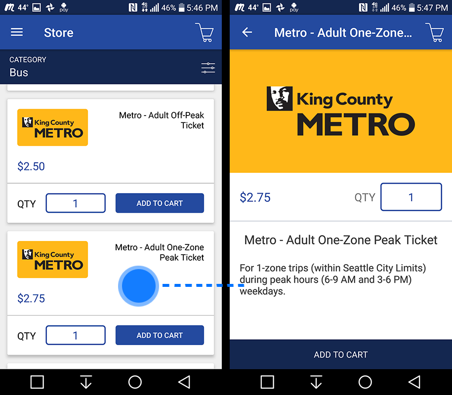
The image on the left is the default Ticket Purchase screen and one of the screens I set out to improve. The image on the right is the info screen the customer can access if they tap on a ticket in the image on the left. Note there are no obvious signifiers letting you know you can touch a ticket for more info.
02
Challenge
What actually went wrong
Three separate failures stacked up to produce that error message. Each one is small on its own, and each one is fixable without redesigning the app.
Problems
Problem 1: App does not inform the user upfront when a ticket they are about to purchase is the ticket that is currently active.
Problem 2: To see when a ticket is active, the customer has to tap it, but nothing signals that tapping is possible.
Problem 3: The screen that tells the user they're using the wrong ticket isn't explicit about why.
Desired solutions
Solution 1: Customer is informed of the time and day(s) a ticket is active before they purchase it / while they are browsing options.
Solution 2: The error window presented to the customer when a ticket can't be used properly informs the customer of why the ticket can't be used.
Restrictions
Don't completely redesign the app. Continue utilizing what works and only redesign the screens that address the problems.
03
Process
Working within the app
The fix had to work inside the existing app, so rather than a long research phase I worked directly from the screens and where they'd failed me. The guiding idea was simple: show riders what they need to know before they buy, not after the ticket fails.
Pulling the active ticket to the top
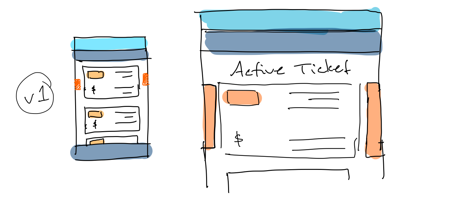
With this in mind the first sketch placed the current active ticket price(s) at the top of the list with callout signifiers on either side to draw the customer's attention. This made it obvious. A downside is it would change the general order of the ticket prices depending on the time of day. This raised the question of what the repercussions might be if the app dynamically shifted the tickets around.
Isolating the active ticket
This mockup takes the dynamic encapsulation of the active ticket further and completely surrounds the current active ticket(s) in an orange ring and adds "Active Ticket" as a header to make it clear what the customer is looking at. The other tickets are placed below.
My dilemma with the tickets rearranging is it might confuse some customers should their intention be to purchase a ticket for later use that is not currently active.
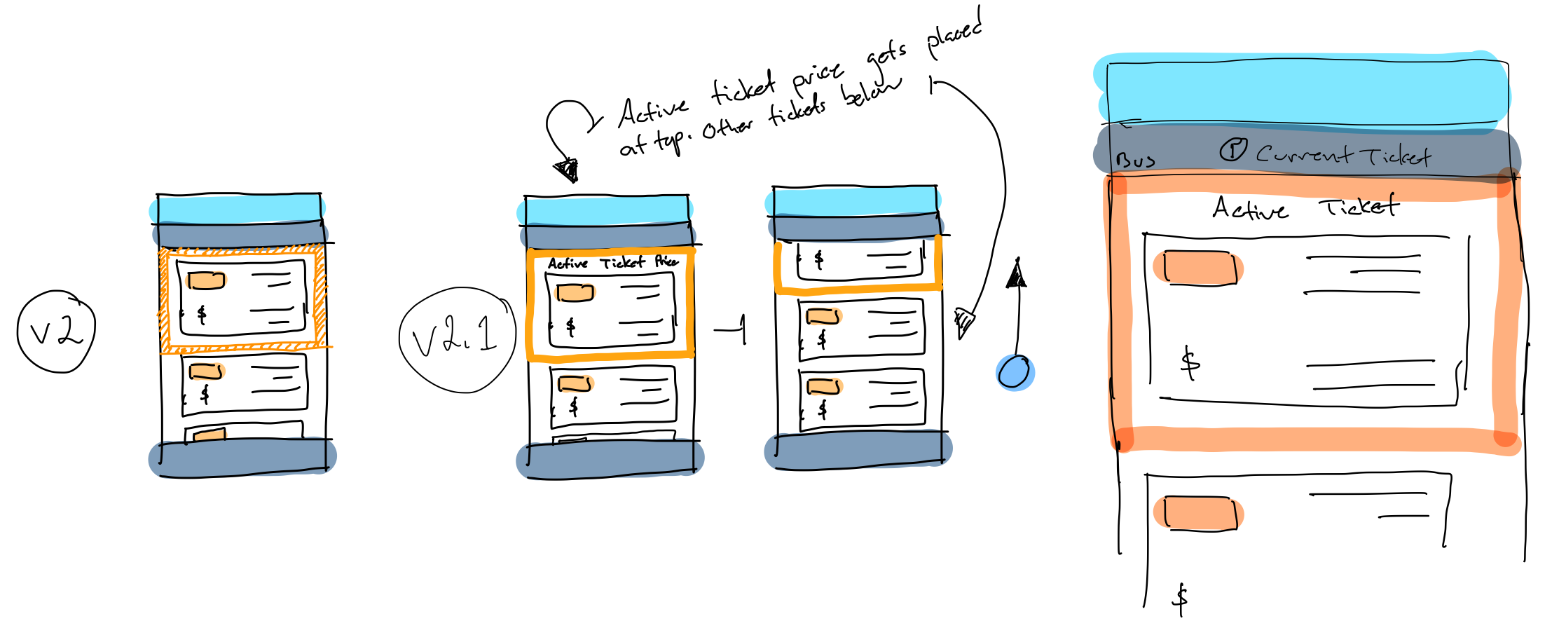
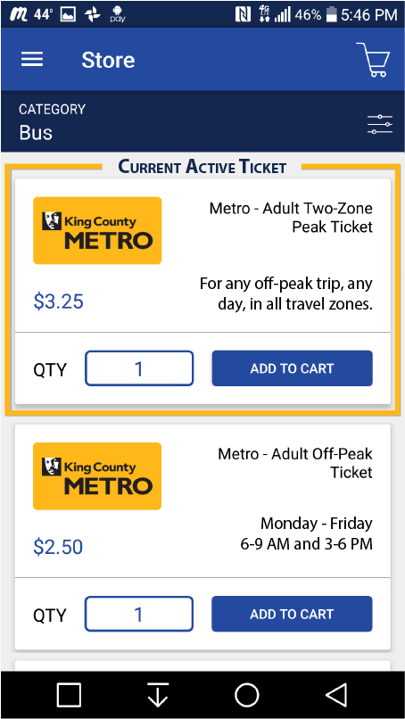
Pin the active ticket
This wireframe places the current active ticket(s) at the top of the app and outlines them with a border along with descriptive text at the top informing the customer that what they are looking at is the current active ticket.
I moved the day/time information for tickets onto the ticket itself so all information is present upfront with no need for further action.
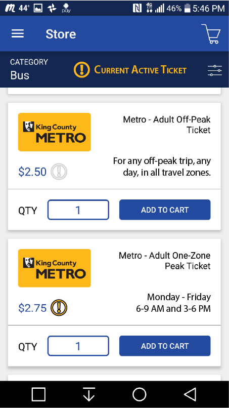
Marking the ticket instead of moving it
This mockup does away with dynamically moving and encapsulating the current active ticket and instead uses a signifier and iconography to inform the customer which ticket(s) are currently active.
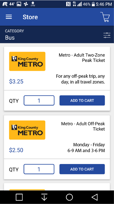
The simplest version
For an even simpler version, this third mockup removes all of the visual and dynamic additions and keeps only the text on each ticket saying when it's active. The user needs to glance at the time on their phone to verify.
Which one would I ship?
If I were shipping one, I'd start from v.01 and test it with riders first. Someone who needs a ticket right now can buy one knowing it will work, and anyone buying ahead for later can still find every ticket below it, the same way they do today.
The open question for testing is whether moving the active ticket to the top, which changes the list's order through the day, confuses anyone.
An error that explains itself
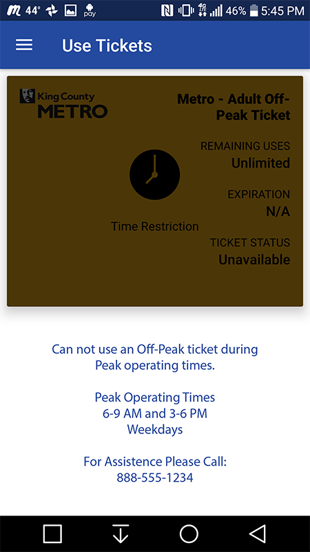
This is a mockup of the error window you see when trying to use a ticket during an invalid time. I've updated the text to directly tell the customer why they can't use their ticket. Now even if you are using the app for the first time, as I was, you'll understand the problem and be presented with an option to get help should you need it.
Functional prototype
This working prototype takes you up to the purchase screen. The end however simply shows the updated Error screen which in turn takes you back to the start of the app.
04
Outcome
What Bytemark shipped later
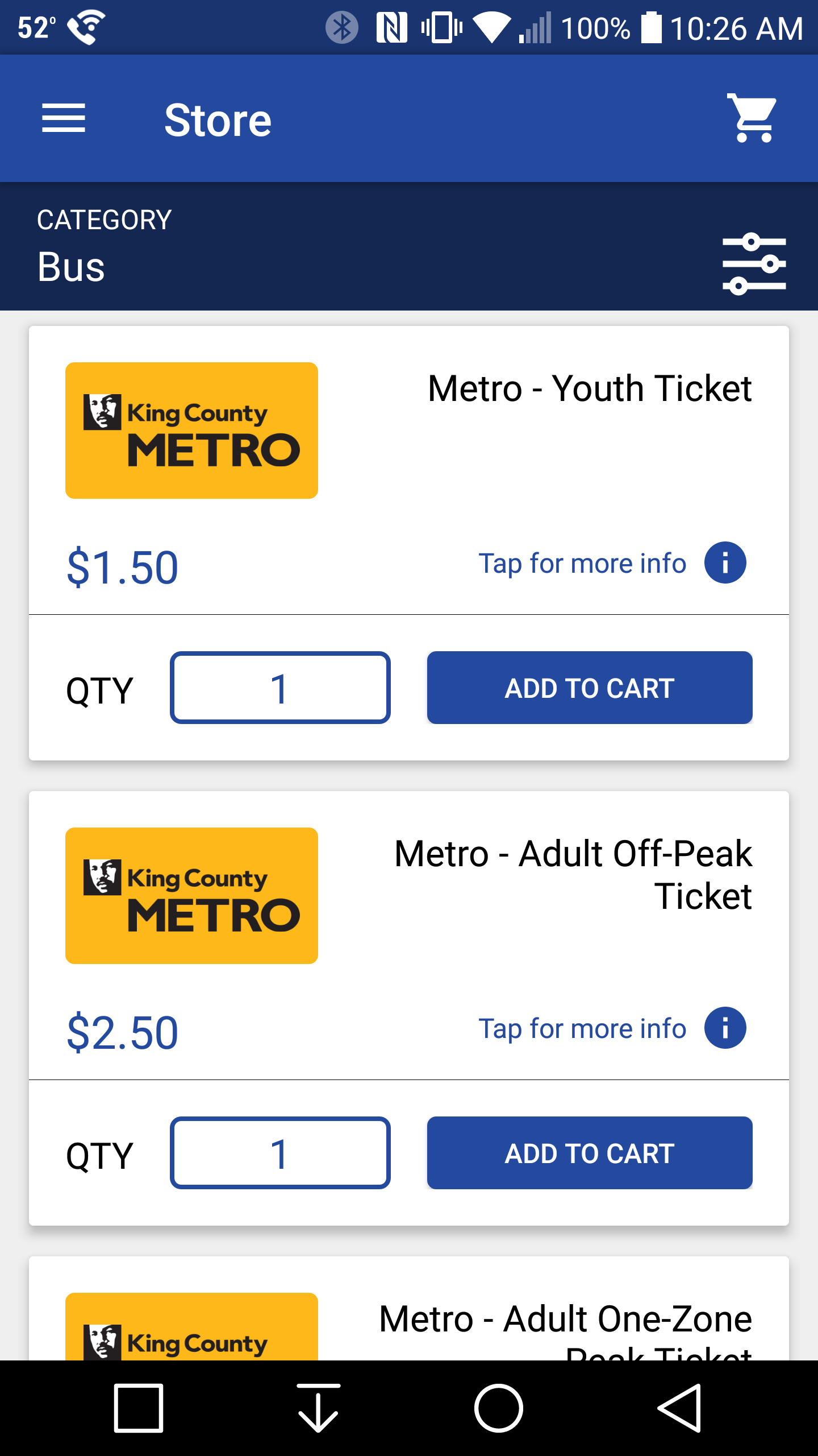
I never sent the redesign to Bytemark, who make Transit GO Ticket. They have since updated the app with a "Tap for more info" signifier on each ticket, which suggests they were aware of the same problem and were working on it independently.