


01
Overview
From Squarespace to my own stack
My portfolio has moved a few times: a hand-coded HTML site uploaded over FTP, then Squarespace, then Figma Sites. I liked Figma Sites. I work in Figma constantly, and publishing wireframes straight from it in one click made for a tidy ecosystem. But it was still young, and like any hosted builder, each one could only give me what it supported. While I am a technically minded designer, I'm not a programmer; that's always been my ceiling.
Once I was comfortable with Claude Code, one of the first big projects I wanted to take on was a personal portfolio that's self-hosted, self-built, and self-maintained. Basically the kind of site I'd always wanted instead of what a builder would allow. It would also afford me the ability to try out any solution I might have.
External costs were the real limit for me. Hiring a front- and back-end engineer would have meant scoping and freezing decisions up front to make good use of their time, not to mention the out-of-pocket expense. For a personal site, that simply wasn't feasible financially. Claude Code let me work at my own pace, for a fixed monthly fee ($100 US), not just on my portfolio but every other project I was building.
The site you're on has been in development since March 2026 and public since September. I've been a technically minded designer and problem solver my whole career, and that's what makes the collaboration with Claude work: knowing the right chain of questions to ask in order to get what I want built.
02
Challenge
A deliberate budget ceiling
I didn't want to spend much, if anything, on the website since its main purpose was just a landing page for my portfolio and personal projects. So the whole thing needed to run on a tight, deliberate budget, with decisions weighed against cost from the start. What I pay for is the GitHub minimum and a Claude Max 5x subscription. Every other service the site touches is on a free account. Inside that ceiling I wanted maximum capability, which meant the budget wasn't a footnote to the design; it shaped the technical choices directly: a static export (The site is pre-built into plain HTML, CSS, and JS files instead of being generated by a server on each visit, so it loads fast and hosts for free.), self-hosting where it was affordable, and a token system that lets one change ripple across the whole site instead of being hand-applied. A lot of what the site is came out of getting the most I could without paying for more than I needed. I learned to appreciate constraints as a designer early in my design career.
03
Process
Building the site
A token-driven design system
I wanted a real place to practice building and maintaining a token-driven design system, close to the industry-standard experience, but on my own terms. The site runs on a central token layer: over two hundred variables in a single root block, used more than a thousand times across the stylesheet, the components, and the pages. Color and type are genuinely token-driven, so recoloring the whole site or retuning the type scale is a one-line edit that propagates everywhere. Spacing works differently. The tokens for it exist, but I barely used them: spacing is written directly, on a 4px grid with a reserved 2px half-step for smaller elements like chips. Typography runs on its own scale rather than being bound to the grid. It's token-based, not tokenized down to the last pixel, which is the honest version of what a design system looks like when one person maintains the whole thing. The tokens are the clear win: they're what let me change components site-wide with almost no effort and keep a consistent look and feel throughout.
Adding a light mode
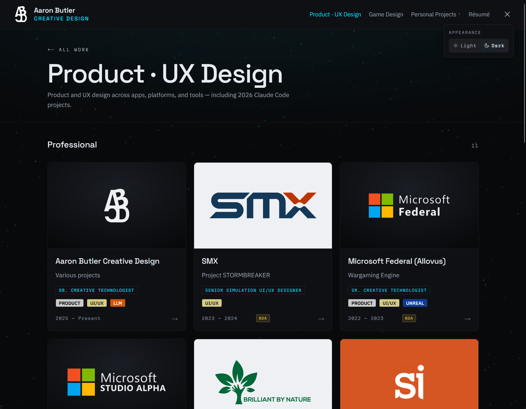
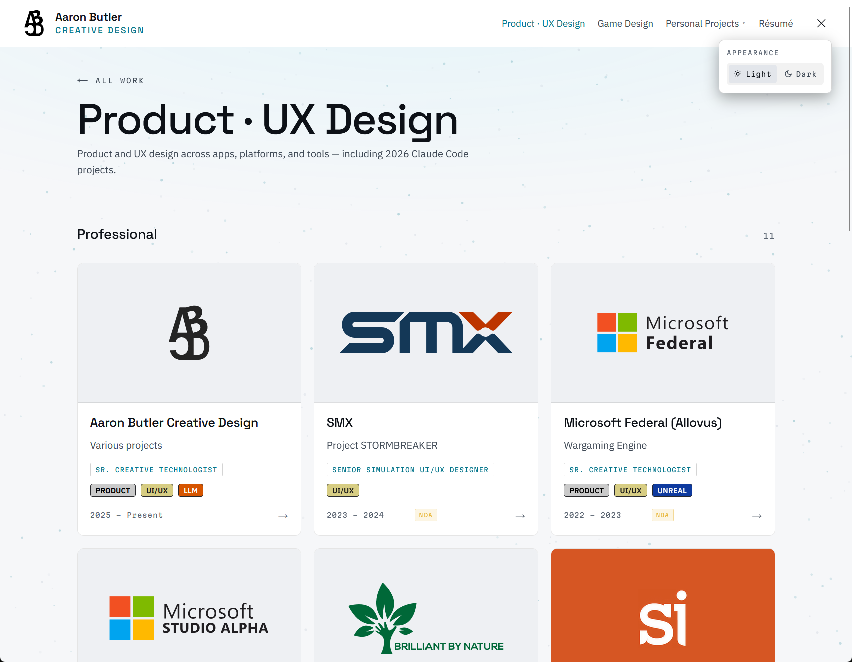
The site started dark and stayed that way for months. Adding a light palette was the real test of whether the token layer had been worth the discipline.
It was. Light mode is about fifty overrides, not a second design system. The dark values are the default, and the light block only redefines what actually differs: surfaces, text tones, scrims, borders, and the accent colors. The rest inherit. That ordering matters more than it sounds. A token added later gets the dark value until someone deliberately gives it a light one, so the failure mode is "looks like dark mode," never "undefined."
Deciding what shouldn't change took about as long as deciding what should. Shadows stay dark in both palettes. So do the type scale, the spacing steps, the radii, the motion timings, and the expertise-pill colors, because those are brand values rather than surface-dependent ones.
Two things needed a real solution rather than a token. Logos with baked-in ink can't be recolored by CSS at all, so both variants ship and the palette picks one with a display swap: no JavaScript, no hydration risk. And the radial gradient sitting behind transparent logo marks had to go flat on light. On dark it does real work, lifting a white mark clear of a near-black field. On light there isn't enough range between the gradient and the surface for it to read as depth; it just reads as a rendering artifact.
The site is a static export, so there's no server to ask which theme a visitor prefers. An inline script sets it before first paint. Without that, every load flashes dark and then corrects itself.
Finding the look
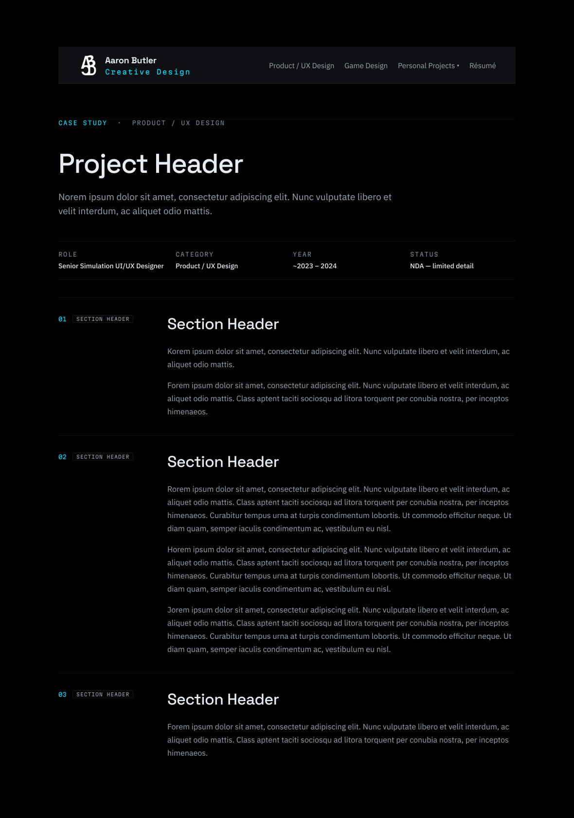
Part of this adventure was trying out Claude Design, which was fairly new at the time, to see how well it handled rapid iteration. I started broad. I took a vertical screenshot of my entire LinkedIn resume and asked it to build a portfolio site for a Sr. Creative Technologist with product, UX, and game design experience. The results proved the approach worked, but the designs didn't click with me enough to run with. I knew I'd never use Claude's first designs as they were; they were a jumping-off point. After further back and forth Claude was able to sharpen what I actually wanted, and I moved on to the real work: the palette and the system. The palette I landed on I had built myself, using a Figma plugin to rapidly generate options by color theory (complementary, split, square, analogous, monochromatic, triadic) until I had a set I was happy with. From there I had Claude generate a bunch of design systems and wireframes using the system so I could see how the combinations worked together. I refined colors, fonts, styles, and components until it felt right. Once the palette and template were settled, Claude packaged up the system and I handed it to a fresh Claude Code session that would be responsible for building the site moving forward.
Figma stays the source of truth. I use Figma's MCP server to have Claude read my wireframes directly, and I run it in reverse too, exporting a near one-to-one version of a page or component back into Figma to keep iterating on it there.
Owning the pieces
This site has allowed me to stop relying on third-party platforms. I pulled my photography off my unused Flickr account and host it myself now. Most video on the site is hosted on my own storage. Vimeo is where 4K files go, or anything that would benefit from giving the viewer resolution options, since bandwidth is where self-hosting gets expensive. This is by design to keep the running cost of the site where I want it. In-browser 3D model viewing was something I'd wanted to try out on my site for years; when I got back into Blender this year the idea came back, so I let Claude know what I wanted to do and told it to research options to see what was possible, and the 3D solution (Three.js renders interactive 3D in the browser; models load as .glb files (a compact 3D format) through a viewer component built for this site.) it found is live on the site now.
The collapsing header behavior you see at the top is another UX feature Claude allowed me to implement. I wanted a page's content to take up more screen space, especially on smaller devices like phones. Again, I explained to Claude how I wanted the feature to work and Claude was able to code up the solution. As with every feature Claude has built for me, it took some back and forth and bug fixing, but the results have been what I set out to achieve.
 case study.](/work/aaronbutler-com/3d-viewer.webp)
A constellation on the landing page
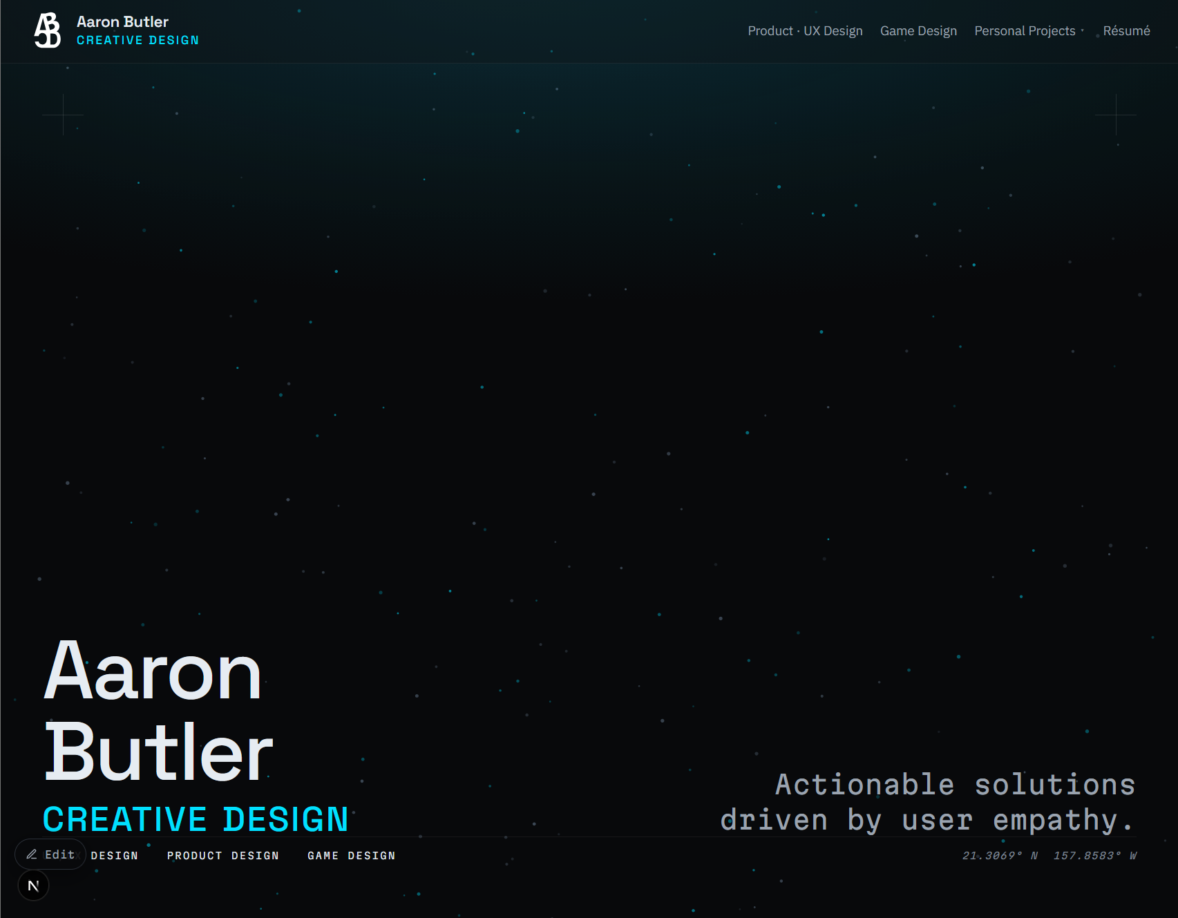
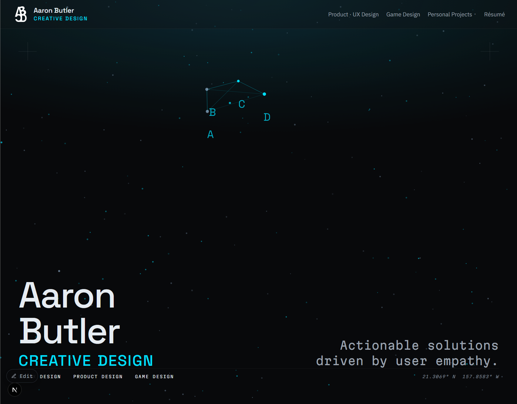
The landing page doesn't scroll. It's a field of stars that drift on their own, and connecting four particular ones lights them up as A, B, C, and D, my practice's initials, with the lines drawing themselves in. It works by tapping on a phone as well as by clicking. The design problem worth solving there was discoverability, since nothing on the page tells you to try it. The answer was to let the field occasionally connect a couple of points on its own, so a curious visitor sees something happen and works out the rest, and I can always raise the number of points if that turns out to be too subtle. The star field carries through the rest of the site as a background, but the game only exists on the landing page.
04
Outcome
A living sandbox
The site is live, and it keeps changing, which is the point. It does what I set out to do: a design system I own and maintain, my own media hosted on my own terms, and interactions I could never have built on a hosted builder, all running inside a budget I can name to the dollar. It's a sandbox, so nothing is final, and that suits me. When I want to try something, I try it.
This case study you're reading is rendered by the data-driven system a Claude Code session built, and an initial draft was written by a Claude AI case study session I created, handed off to the Claude Code site dev session and then further iterated on and rewritten as needed by me. That's a small recursion I'll admit to. I'm in the process of writing up my experiences working with Claude Code and AI so I can share the details of how this whole collaboration experience has been.