


01
Overview
Microsoft's next-generation simulation engine
Studio Alpha was a forward-looking org inside Microsoft, around 60 people, building a next-generation simulation engine. The idea was general purpose: a customer brings their own data set, plugs it into the engine, and gets a real-time simulation back that they can interact with. The simulation ran on Azure, and the engineering team brought Cesium, a 3D geospatial platform, into Unreal to render the sim's output as real-time geospatial data over real-world inputs like satellite imagery. That integration was mostly engineering work, but Cesium and Unreal were the two platforms I designed within.
I came on as a Sr. Creative Technologist through an outside company, Allovus, though day to day, the other contract designers and I were treated as full-time members of the org. While team members came and went, the design team as a whole remained small for the size of the org: a UX Researcher, a UX Writer, one other UX Designer, a Systems Designer, and later on a dedicated digital artist. Engineers owned the under-the-hood tech, the satellite imagery integration, and getting everything talking to Unreal. I worked day to day with a dedicated Unreal engineer to get my work into the engine, and beyond that mostly with my manager (the UX Director), the Technical Director, and now and then the Studio Director.
My side of it was the creative technology work: modeling a custom library of 3D assets built to a shared scale, designing the real-time visual language for the sim, and mocking up the UI for how a user would read and control it. The design system was based on Microsoft's Fluent, and I worked in Figma, Blender, and Unreal Engine 4.27.
Design
FigmaBlender
Engine
Unreal Engine 4.27
Platform
AzureCesium
Design System
Microsoft Fluent
02
Challenge
Making a thousand moving objects readable
Studio Alpha's goal was a simulation engine that could run anywhere from a local scene up to a global one, for almost any subject. A few of the cases we looked at: dozens of UAMs (urban air mobility passenger drones) ferrying people to and from a busy international airport, a space agency that wanted to test how weather would affect the flight patterns of experimental aircraft, and land, air, and sea logistics planning. Stormbreaker, a wargaming application for SMX, was one of the first applications lined up to run on the engine.
Designing for that range was the hard part. It all had to hold up whether the user was a space agency, a defense agency, or some company we'd never met showing up with their own data set. Custom tooling was a selling point, but it was an extra. The default features had to work out of the box.
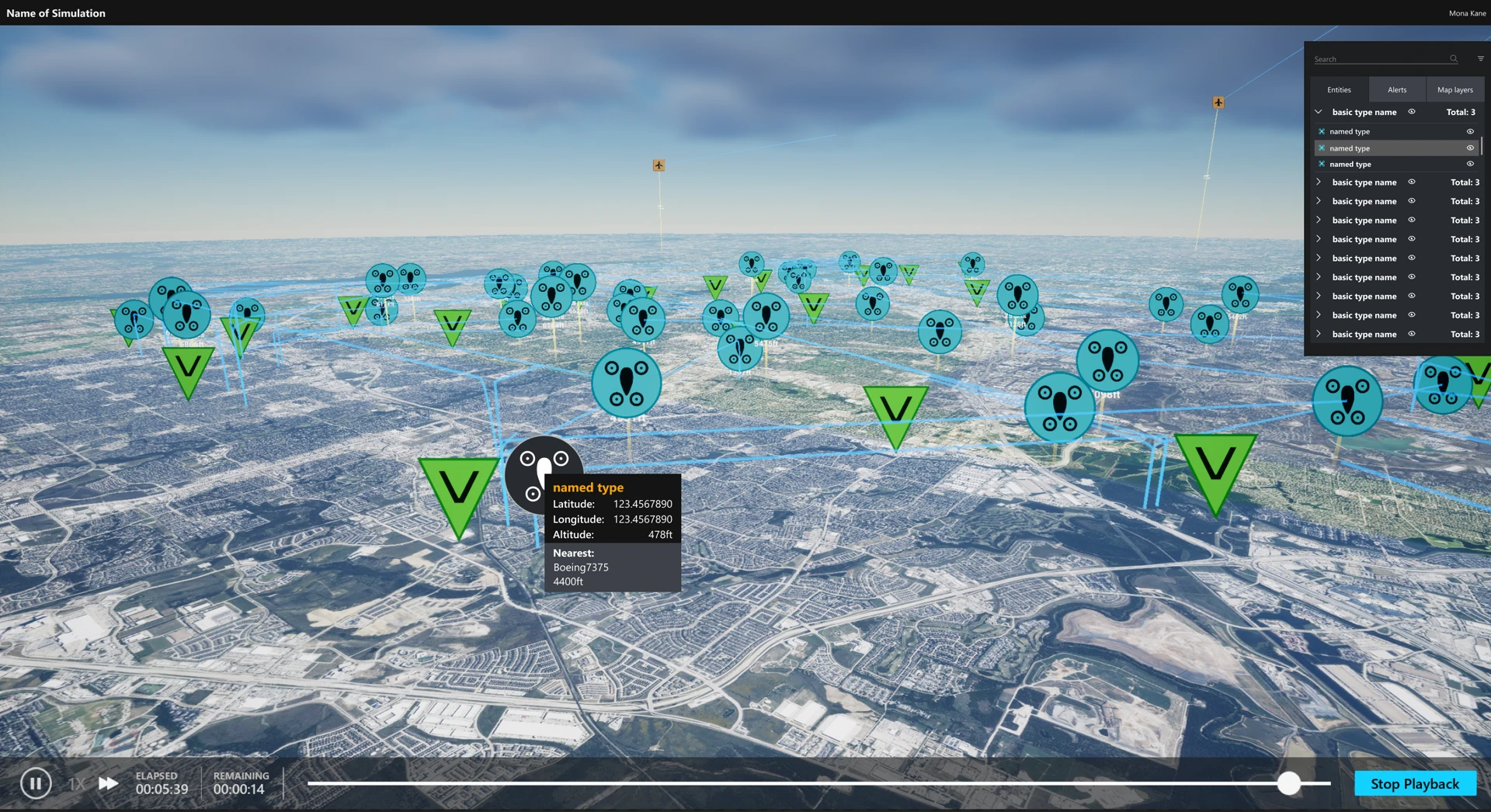
Sitting on top of that was my main problem. A running sim could have hundreds, sometimes thousands of moving objects over real satellite imagery, and a user needed to read them at a glance: speed, direction, where something was headed, its altitude. Putting all of that on everything at once would be a UX disaster, so the information had to be broken into visual hierarchies, with users free to toggle on whatever they cared about.
The stakes were pretty direct. Get the interaction and readability wrong, and the user is left with the same raw data they brought in, just sitting inside the engine. Get it right, and they could drive it: take control of their vehicles, set up real-time scenarios, then rewind, fast-forward, and review the recorded run, with notes and comments along a timeline and group discussions around it. One request kept coming up in customer testing: a version of Teams inside the sim itself.
The project was already on Unreal 4.27 when I joined, and it stayed there the whole time. Moving to Unreal 5 came up more than once but never happened, and staying mostly cost us performance. UMG, Unreal's UI system, was the upside: easy to learn and customizable, which paid off once I started building elements in-engine.
03
Process
From beauty card to SmartCard
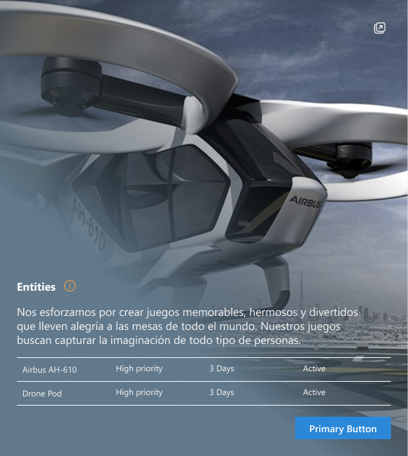
When I joined, the only thing that existed for showing information about a selected object was a single high-fidelity mockup of an entity card. Leadership had made this beauty card for the deck that pitched the project's goals and brought in early customers, and a few subject-matter experts had contributed ideas about what it should show. The concept was that when you selected an entity in the sim (say, one of those hypothetical UAMs), a card would pop up with details about it. That card was my jumping-off point.
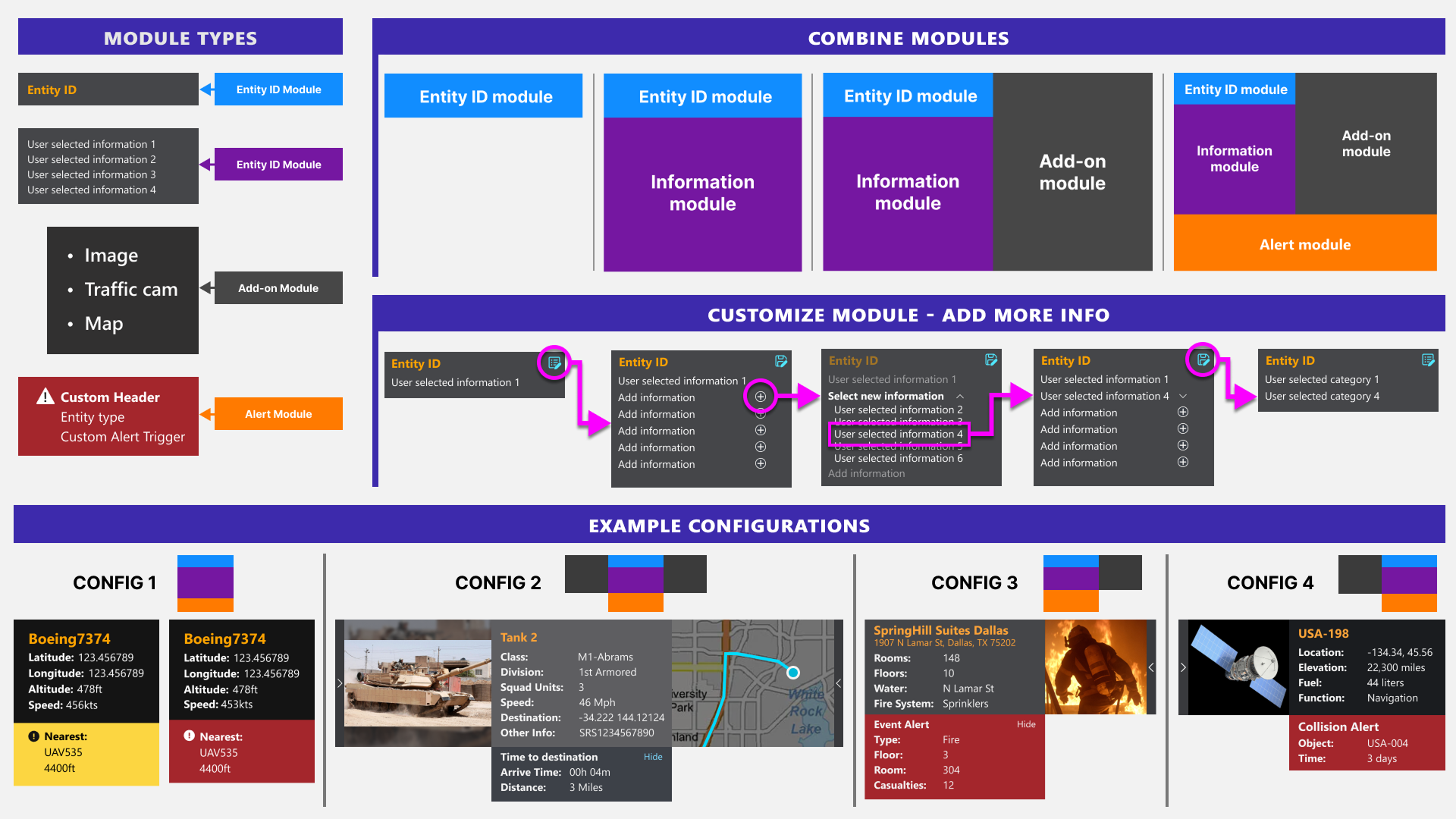
From there I talked with knowledgeable users and customers, did my own research, and leaned on the intuition I'd built as a game designer and from a lot of hours in simulation games. The catch with one fixed card was the sheer number of use cases it had to cover. So I grew it into what I ended up calling the SmartCard: a basic info-card component that users could attach customizable subcomponents to, based on what each of them needed to see.
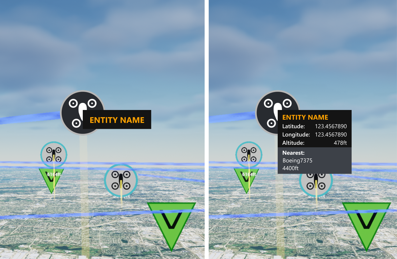
Entity information lived in two places. The SmartCard appeared over the object in the sim and showed just what the user wanted at a glance, which they could customize from several places in the UI. Click the card's info control and a drawer slid out from the right side of the screen with most, if not all, of the detail on that entity.
Out of the box, if someone ran a sim without customizing the card first, it defaulted to just enough to identify the entity they'd selected, with everything else a click away in the drawer. What that default set should be was still a work in progress. There wasn't one right answer across a space agency, a defense agency, and everyone else, so the idea was to keep shaping it toward an equilibrium as more customers told us what mattered to them.
Entity list
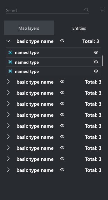
The other always-on UI piece was the entity list, pinned to the top right of the screen. It showed every entity in the sim, active or not, and it was context sensitive: what it displayed shifted depending on the type of entity you had selected, and users could always customize which data sets they wanted to see. It had search and filtering so you could pull up an entity without panning around and hunting for it on the map, plus right-click context menus for even more interaction options. Double-click an entity in the list and the camera would zoom in, frame it, and follow it as it moved around.
Since UMG gave me room to work, I built first versions of some of these elements directly in the engine and handed them to the Unreal engineer to finish, rather than only passing along flat Figma mockups.
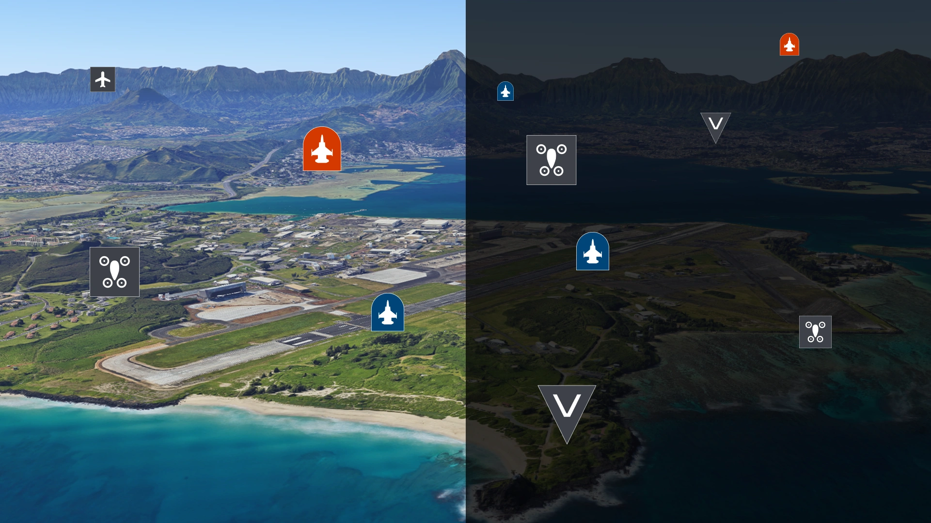
Icon explorations
Part of my job was creating custom icons for the things Fluent didn't already cover.
Trail explorations
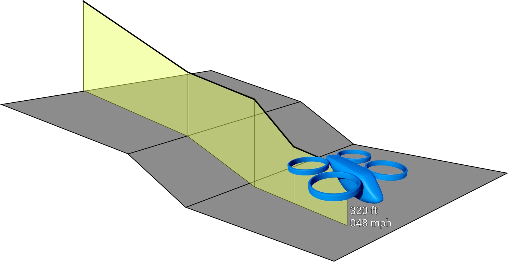
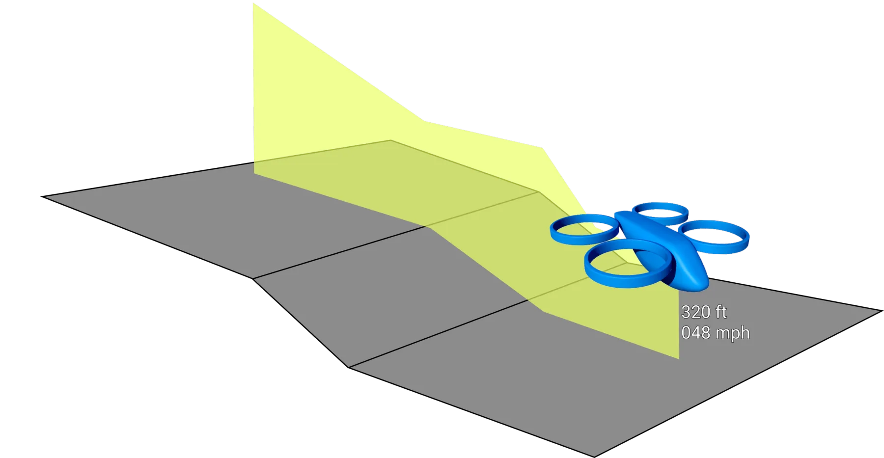
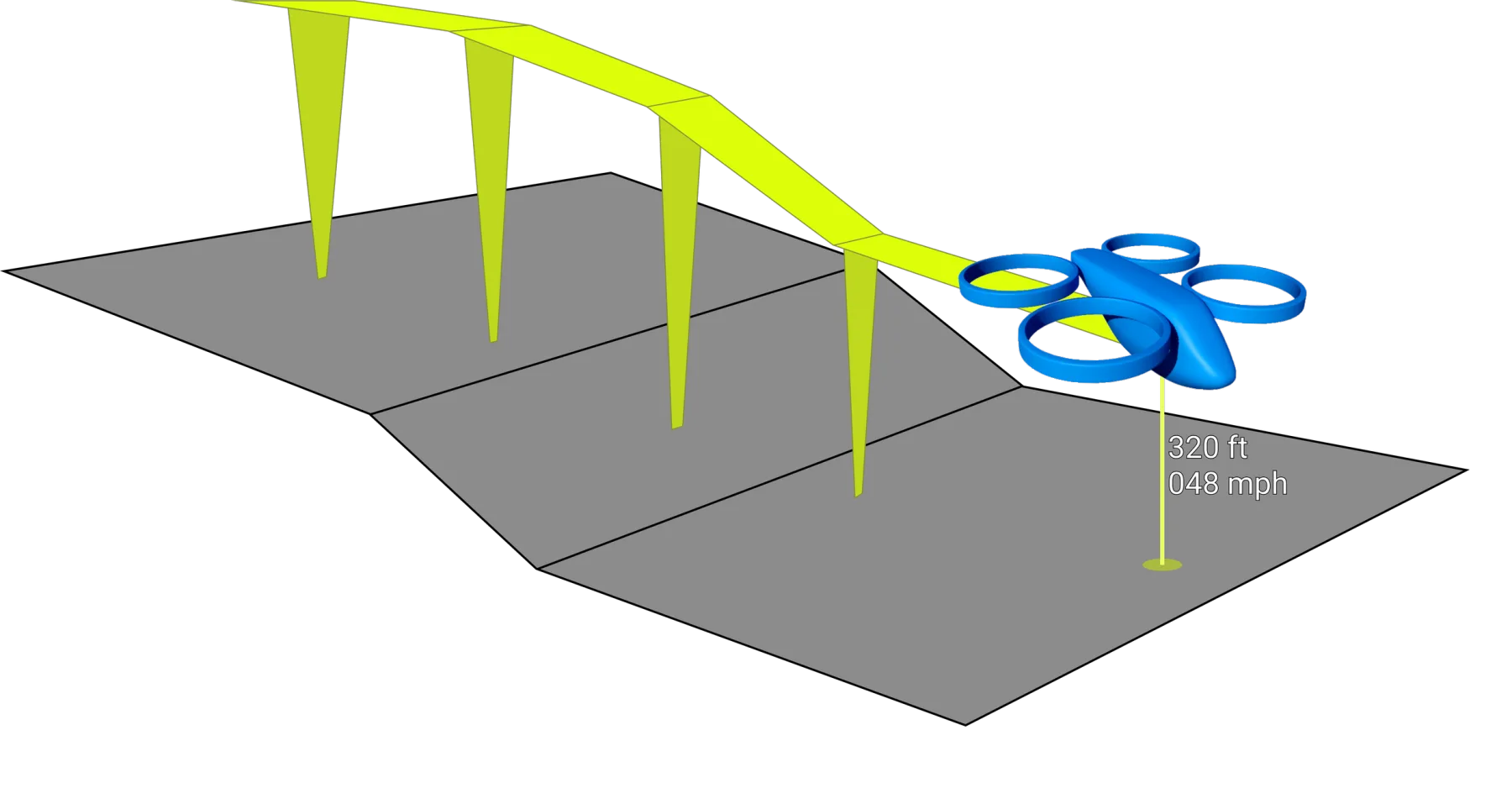
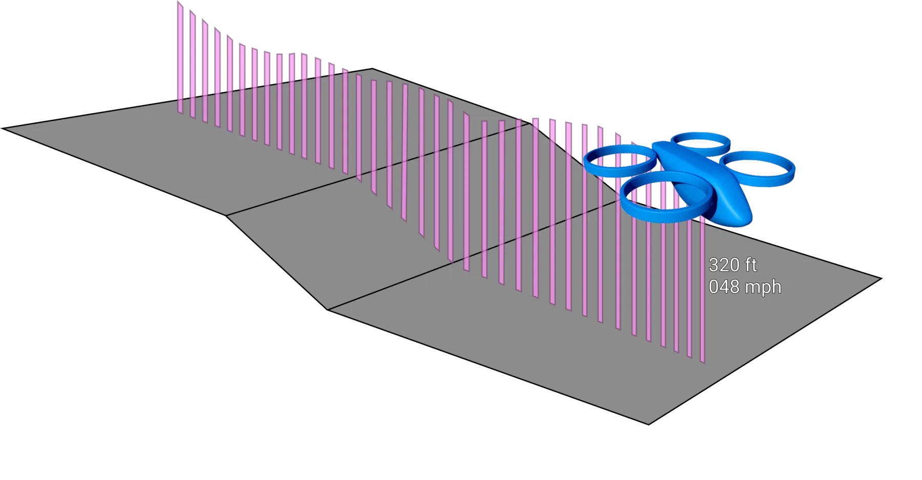
One of the signifiers I dug into was ghost trails for objects moving through the sim: how a trail might show elevation, direction, and speed all at the same time. I got four explorations into it before the org was shuttered, so these are open experiments rather than a solved system. I modeled the drone (a UAV) in Blender and built the rest in Figma.
Custom models
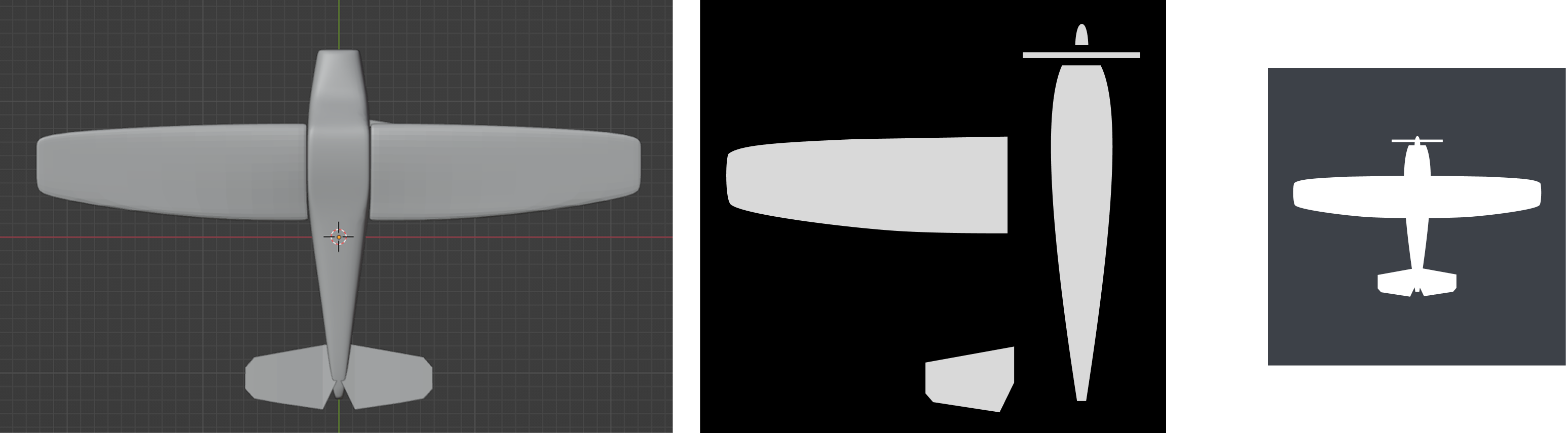
The project needed detailed models for close-up views. Games and sims swap in more detailed versions of an object as the camera gets closer (called levels of detail, or LODs). To avoid copyright issues, I volunteered to build some early prototypes myself in Blender. They were well received and went into the sim as the most detailed level, swapping in for the icon once the camera got close enough. Had the org not been shuttered, I'd have added materials and some basic animation.
Base model types: carrier, submarine, fast mover aircraft, rotorcraft, and one ground vehicle. All built to a shared scale. Click to load and orbit the showcase.
04
Outcome
What survived the shutdown
The SmartCard was the part I was most proud of, and it got the most traction too. I presented it at one of our org-wide sprint reviews, and it turned into a recurring talking point after that. I brought it up with customers as well, where the flexibility and customization tended to catch their attention.
I only got to implement an initial default version, though. The modular subcomponents, which were the whole point of the idea, never got built before the org was shut down.
Toward the end of Studio Alpha, the org narrowed its focus onto that wargaming application, Stormbreaker. I did the initial designs for some of its early application-side interfaces while keeping on with the sim work, and once a second UX designer was hired to own the application side, I became the dedicated simulation designer.
Studio Alpha was closed before any of this shipped. The engine was the ambitious swing, and it didn't land. Stormbreaker kept going regardless: SMX moved the contract to Microsoft Federal, and I moved with it, along with the rest of the creative team and some of the engineers. A reduced form of the SmartCard carried on there. So the idea I cared about most had proved itself, with the org and with customers, but it never got to grow into what I'd designed it to be.